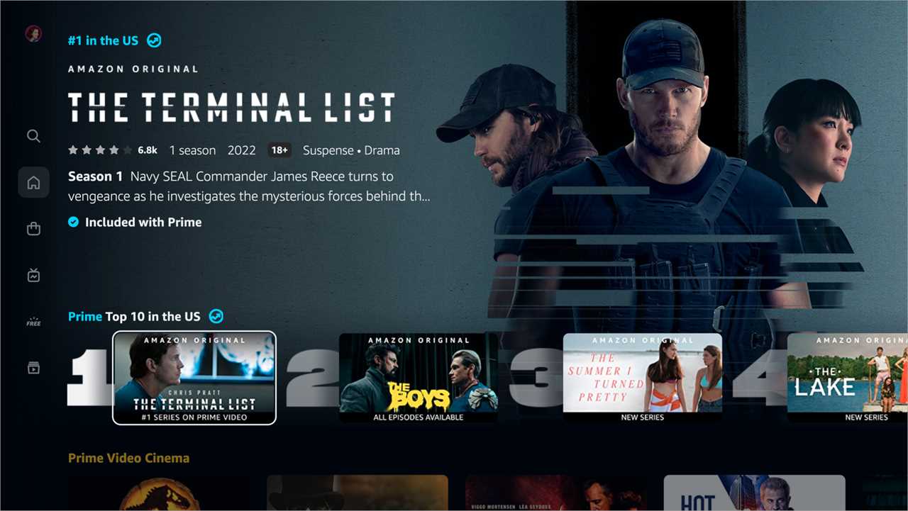
Amazon excels at making a seemingly infinite array of retail items feel organized and accessible. So why has its streaming service, Prime Video, long had such an ugly, clunky user interface? “Amazon Prime Video’s Library Is Now Genuinely Impossible to Browse,” the online entertainment magazine Paste declared in a headline last year. As the streaming business got more competitive, notably with the arrival of glossy new entrants like Disney+ and HBO Max, the poorly designed Prime Video interface stood out even more.
On Monday, Amazon finally got in the game, unveiling a redesign 18 months in the making that includes a simplified main navigation menu, a more direct route to sports programming, a new way to highlight live TV, and carousels designed to make the interface more cinematic and help users find what they want to watch more quickly.
The overhaul comes as Amazon pushes deeper into the entertainment business. The tech giant closed its $8.5 billion acquisition of Metro-Goldwyn-Mayer in March. It will pay the National Football League an estimated $1 billion annually for exclusive national broadcast rights to Thursday Night Football, a deal that begins in September. Prime Video’s mega-budget “Lord of the Rings” series will also debut that month. As part of its recent Prime Day, Amazon’s annual deals event for members, the company cut prices on its new line of Fire flat-screen televisions up to 40 percent.
The leading streaming service, Netflix, is also back on its heels at the moment, having lost subscribers for the first time in a decade in its spring quarter, with more losses expected to be announced on Tuesday.
As part of Amazon’s redesign, users will notice a new color palette, larger artwork and a more prominent Top 10 list. Notably, given Amazon’s effort to compete with Roku and Apple to sell subscriptions to third-party services like Paramount+ and BritBox, the new interface improves the ways in which such subscriptions are integrated. (Amazon calls these other streaming platforms channels.)
“It’s important for us that customers understand the breadth of choice that they have and understand the benefit of using the Prime Video application for all of their streaming,” Helena Cerna, an Amazon director of product management, said in a video interview. In a blog post, Amazon said the overhaul would make Prime Video “less busy and overwhelming.”
The new interface will begin rolling out worldwide this week, with living room and Android devices first in line, Ms. Cerna said.
In some ways, the redesign makes Prime Video look more like competing apps, including Netflix. “We really wanted to make the Prime Video experience effortless and delightful and easy to use,” Ms. Cerna said. “And part of ease of use is familiarity. So in instances where, you know, there are established patterns in the wild, we leverage those.”


