Change in the Air
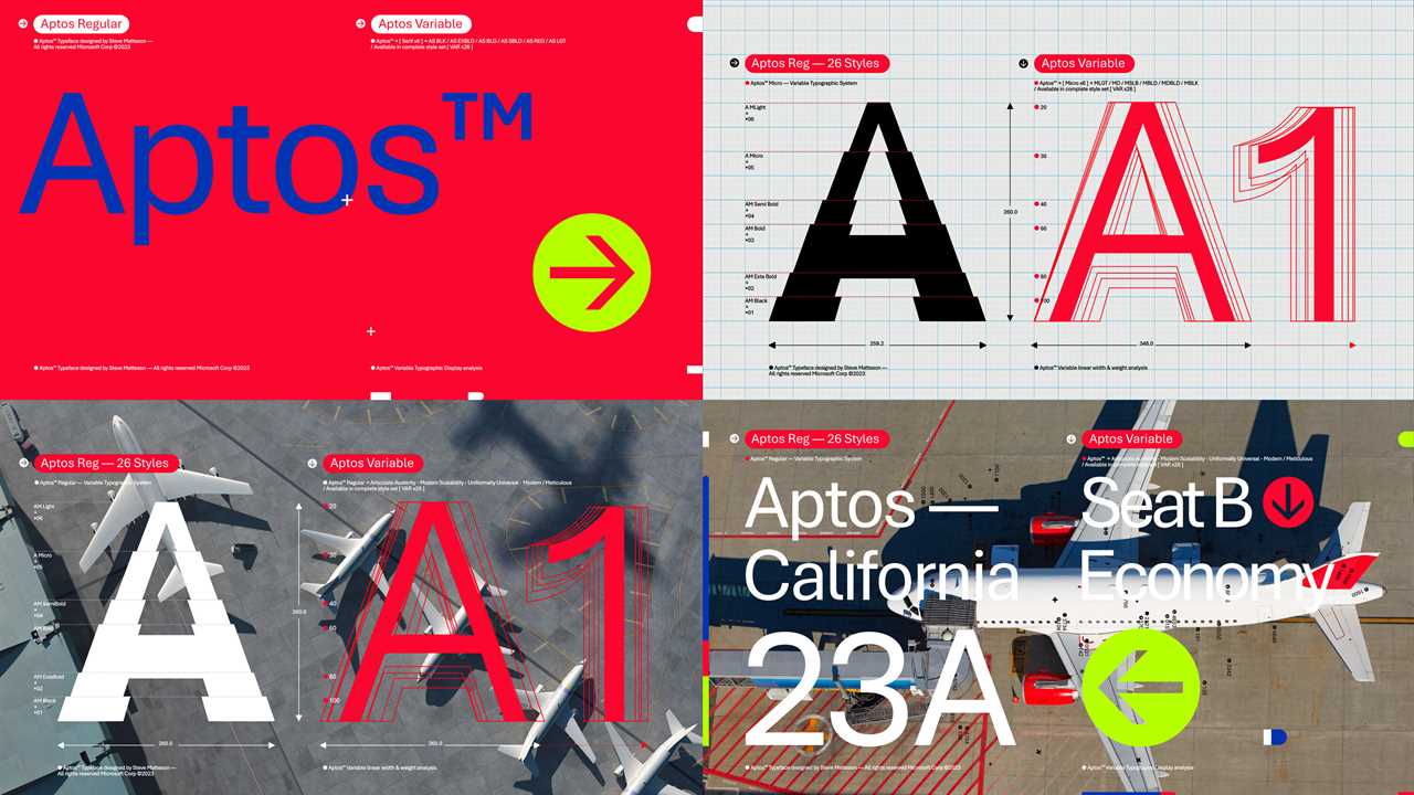
Have you noticed a subtle shift in the way your Microsoft Word documents look recently? After 17 years of Calibri reigning as the default typeface, users are now finding themselves typing in a new font called Aptos. This change is not just limited to Word but also impacting PowerPoint, Outlook, and Excel.
Design Matters
While letters may seem like just letters to many, designers and typography enthusiasts know that the choice of typeface can make a significant impact. The shift from Calibri to Aptos has sparked discussions and reactions across the design community.
The Reason Behind the Change
Jon Friedman, Microsoft's corporate vice president for design and research, explained that the decision to introduce Aptos was driven by a desire to offer a fresh and modern typeface that aligns with the current era of computing. The move reflects a larger trend in the design world towards sleeker and more contemporary aesthetics.
Serif vs. Sans Serif
In the realm of typefaces, a key distinction is made between serif fonts, which feature small lines or tails on the edges of letters, and sans serif fonts, which have a cleaner and more streamlined appearance. The shift from Calibri to Aptos may signal a preference for the latter's minimalist and modern design.
Did you miss our previous article...
https://trendinginthenews.com/tech-giants/googles-once-happy-offices-feel-the-chill-of-layoffs