SAGE doom-mongers were WRONG when they predicted 4,000 daily Covid deaths this winter before they plunged the country into a crippling second lockdown, a shocking graph shows.
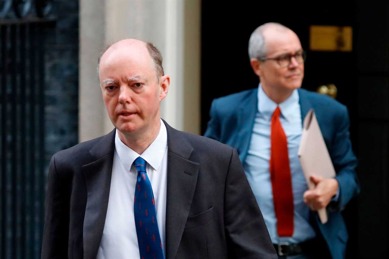
The black line below shows the actual number of deaths compared to the grim “winter scenario” laid out by Chris Whitty and Patrick Valance.
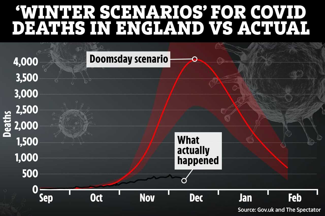
Since mid-November, deaths have been beneath even the most conservative forecast by the government scientific advisers .
And according to The Spectator, this low number of deaths over the last two weeks is not due to the lockdown.
That’s because it takes three to four weeks for changes in restrictions to show in Covid fatality data.
The current figures – which show daily deaths peaking at 425 on Nov. 18 – actually reflects pre-lockdown infections, the report says.
This comes as Michael Gove has revealed that the decision to plunge England into a second lockdown – devastating businesses across the country – was RUSHED.
Writing in The Times, the cabinet minister said he was in Surrey on a Friday morning when he was summoned to an “action meeting” in London.
He wrote: “Of course, I’d change my diary: was the meeting tomorrow, or Sunday? No — please get back to London as soon as possible.”
And the government were warned that the SAGE winter scenarios could be wildly inaccurate.
At the start of November, the predications were branded “Noddy Land figures” and “clearly ropey” by experts who said the modelling that provided the figure was outdated.
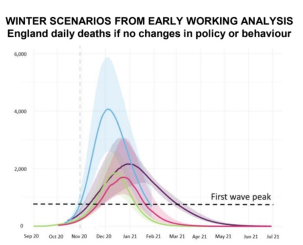
Former Supreme Court Judge Lord Sumption said: “Some of the statistics they have produced over the last few days simply don’t bear a moment’s examination.
“The most extreme one is the suggestion that there could be up to 4,000 deaths a day.
“That is a figure which no country has ever come close to. These are absolute Noddy Land figures.”
Microbiologist Professor David Livermore added that the figures are “clearly ropey statistics” and said they “just don’t make sense”.
Following the criticism, chief medical officer Professor Whitty said he had personally “never used” the kind of six-week projection that Boris Johnson used to claim 4,000 deaths a day could happen by December.
And Sir Patrick Vallance confirmed the graph was shown to the PM the week before he announced plans for a second national lockdown.
Yet, insiders played down the significance of the slide with a source saying: “There was no one graph that turned the tide.”